

Apple
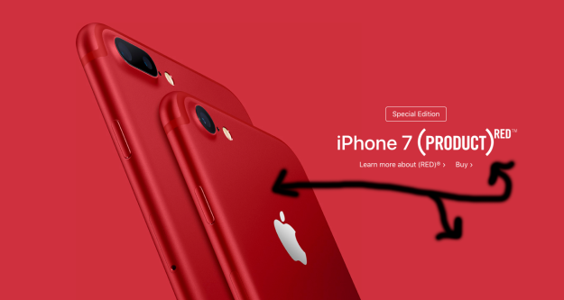
For years Apple has shown the world that great product design comes above all else. Steve Jobs used to say: “Quality is more important than quantity. One home run is much better than two doubles.” This attention to detail is reflected in anything associated with the company. This includes the beautiful examples of graphic design shown on their website: Apple.com. This advertisement for Apple’s new PRODUCT RED iPhone 7 is an example of good, simple, design. While the specific designer of this image is not mentioned it is fair to say a professional designer produced it.
Contrast
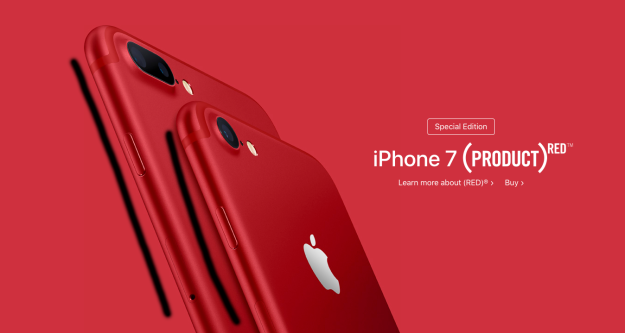
“Contrast, as a principle of design, differentiates line, value, shape, texture, and color. It helps to create dominant areas within a composition, emphasizing what is most important (i.e. focal points). Contrast makes shapes more clear.” There are only 3 colors in this example, red, white, and black. There is a stark contrast between the red background and image, and the white text. The red appropriately dominates this composition as it is supporting the organization RED. The white text is easy to see and balances out the overwhelming amount of red.
Repetition
“Repetition means to repeat one or more of the five elements of design. Repetition within a composition helps creates unity, and therefore, order.” The two iPhones are aligned and stacked creating repetition. Repetition helps a design to feel more unified. Not only are the physical elements of this ad repeated the color red is repeated through out the composition to send a message.
Alignment
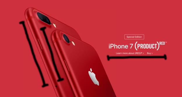
“Alignment, as a principle of design, is used to help place or organize the shapes within the format and give it a unified structure (i.e. shapes are placed horizontally and vertically, above and below each other). The opposite of aligning shapes would be placing them randomly resulting in chaos.” Since this design is simple and does not have a lot of text or objects it is very important that they are aligned. The two iPhones are diagonally aligned creating organization and movement. The text to the right is also center aligned which can be a bold move. In this case the center alignment of the text is deliberate pleasing to look at.
Proximity
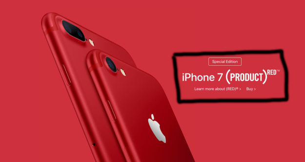
“Proximity is the arrangement of shapes that are placed near each other in a format used to create a sense of balance, dominance, focal point, etc.” The text to me is the focal point of this composition. The information is close in proximity because it all pertains to each other. It wouldn’t make sense to have what the product is in the top left corner and all other text spread around the page. Having everything close together creates a focal point and organizes the information.
Color
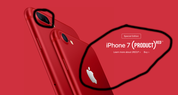
I don’t feel color needs to be defined in the way the other principles have been. Color has a personality, temperature, and can be one of the most effective tools in sending a message. This graphic uses only 3 colors. Red is the dominating color while black and white act as a contrast to it. Red is a very dominant and powerful color that draws attention to itself. The company RED was organized to draw awareness to the growing threat of HIV/AIDS. This ad would not make as much sense not would it send the same message with a cool tone like blue.
Conclusion
This ad for the the iPhone 7 PRODUCT RED is great example of design. It is simple, elegant, and effectively uses the principles of design. Some of the most obvious principles that are used are contrast, unity, alignment, scale, and proximity. A good design is usually a simple one, and this is a good design.
